
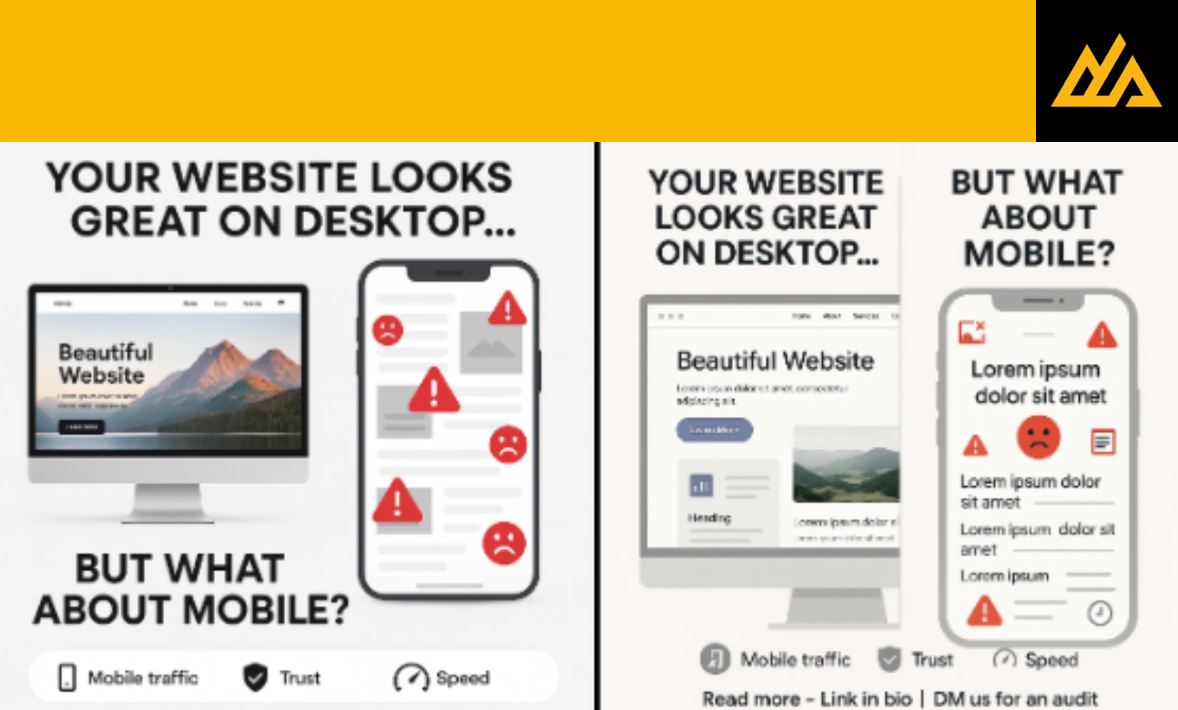
In today’s digital landscape, your website serves as the first impression for potential customers. With over 60% of global web traffic coming from mobile devices, having a mobile-friendly website isn’t just an option it’s a business necessity. If your website fails to deliver a seamless mobile experience, you’re not just missing opportunities; you’re actively pushing customers toward your competitors.
The statistics are staggering: 57% of users won’t recommend a business with a poorly designed mobile site, and 40% will visit a competitor’s site instead. This means that every second your website takes to load or every element that doesn’t display properly on mobile could be costing you valuable customers and revenue.
The Mobile Revolution: Why Mobile-First Design Matters
Mobile internet usage has fundamentally changed consumer behavior. People no longer wait to get home to browse websites or make purchases. They expect instant access to information, seamless navigation, and quick transactions all from their smartphones. This shift has made mobile optimization not just about user experience, but about business survival.
When customers encounter a website that’s difficult to navigate on their mobile device, they form an immediate negative impression of your brand. This poor first impression extends beyond just the website experience; it affects their perception of your entire business operation. In an era where customer experience defines brand loyalty, a non-mobile-friendly website can be devastating to your reputation.
Key Signs Your Website Is Driving Mobile Customers Away
• Slow Loading Times: If your website takes more than 3 seconds to load on mobile devices, you’re losing customers
• Unresponsive Design: Text that’s too small to read, buttons that are hard to tap, or content that doesn’t fit the screen
• Poor Navigation: Complex menus that don’t work well on touch screens or navigation that requires excessive scrolling
• Broken Functionality: Forms that don’t work, images that don’t load, or features that malfunction on mobile devices
• Non-Mobile Checkout Process: Complicated purchase processes that frustrate mobile users
The Financial Impact of Poor Mobile Experience
The cost of ignoring mobile optimization extends far beyond lost website visitors. Let’s examine the real financial implications:
| Business Impact | Cost/Loss (Indian Rs) | Annual Impact |
| Lost Sales Due to Poor Mobile UX | ₹50,000 – ₹5,00,000 per month | ₹6,00,000 – ₹60,00,000 |
| Reduced Search Engine Rankings | ₹25,000 – ₹2,00,000 in lost organic traffic value | ₹3,00,000 – ₹24,00,000 |
| Increased Bounce Rate Impact | ₹15,000 – ₹1,00,000 in advertising waste | ₹1,80,000 – ₹12,00,000 |
| Brand Reputation Damage | ₹30,000 – ₹3,00,000 in customer acquisition costs | ₹3,60,000 – ₹36,00,000 |
| Total Potential Annual Loss | ₹14,40,000 – ₹1,32,00,000 |
These numbers represent conservative estimates for small to medium businesses. Larger enterprises can face losses in crores when mobile experience is compromised.
How Mobile-Unfriendly Websites Affect Different Industries
E-commerce Businesses suffer the most immediate impact, with mobile users accounting for over 70% of online shopping traffic. A poorly optimized mobile site directly translates to abandoned carts and lost sales.
Service-Based Businesses lose potential leads when contact forms don’t work properly on mobile devices or when important information like phone numbers and addresses are difficult to access.
Restaurants and Local Businesses miss out on impulse customers who search for nearby options on their phones but can’t easily view menus, hours, or contact information.
B2B Companies may think they’re immune, but decision-makers increasingly use mobile devices for initial research, making first impressions crucial even in business-to-business scenarios.
The Google Factor: Why Search Engines Punish Non-Mobile Sites
Google’s mobile-first indexing means that the search engine primarily uses the mobile version of your website for ranking and indexing. This fundamental shift makes mobile optimization essential for SEO success. Websites that aren’t mobile-friendly face:
• Lower search engine rankings across all devices • Reduced visibility in local search results • Decreased organic traffic • Poor performance in voice search results • Limited featured snippet opportunities
When considering What Happens When Your Competitor Uses Digital Marketing (And You Don’t), mobile optimization becomes even more critical. Competitors with mobile-friendly websites will consistently outrank you in search results, capturing the customers you’re losing.
Essential Elements of Mobile-Friendly Design
Creating an effective mobile experience requires attention to several key elements:
Responsive Design Framework: Your website must automatically adjust to different screen sizes and orientations, ensuring consistent functionality across all devices.
Touch-Friendly Interface: Buttons and links must be sized appropriately for finger navigation, with adequate spacing to prevent accidental taps.
Optimized Images and Media: Visual content should load quickly without compromising quality, using modern compression techniques and appropriate file formats.
Simplified Navigation: Mobile menus should be intuitive and easy to use, often requiring a complete rethinking of desktop navigation structures.
Fast Loading Speed: Mobile users expect instant access, making speed optimization crucial for user retention and search engine rankings.
The Design Scoot Advantage: Transforming Your Mobile Presence
Design Scoot offers you the best mobile website designing services, understanding that mobile optimization is more than just making your site fit smaller screens. Our comprehensive approach ensures your website delivers exceptional experiences across all devices while maintaining your brand identity and business objectives.
Our mobile-first design methodology addresses every aspect of user experience, from initial loading speed to final conversion. We understand that Feel Like Your Website Isn’t Doing Enough? Read This Before You Redesign It often stems from poor mobile performance, and our solutions target these specific pain points.
When businesses partner with Design Scoot, they typically see immediate improvements in mobile engagement metrics, search engine rankings, and ultimately, customer conversions. Our approach combines technical expertise with creative design, ensuring your mobile website not only functions flawlessly but also creates memorable user experiences.
Leveraging Technology for Better Mobile Experiences
How AI Is Helping Digital Marketers and Graphic Designers Work Smarter becomes particularly relevant in mobile optimization. AI-powered tools can analyze user behavior patterns, predict optimal design elements, and continuously improve mobile experiences based on real user data.
Modern mobile optimization also involves implementing progressive web app (PWA) technologies, accelerated mobile pages (AMP), and advanced caching strategies. These technologies work together to create mobile experiences that rival native applications while maintaining the accessibility of web platforms.
The Agency Advantage: Why Professional Help Matters
Why You Need an Agency to Bridge the Gap Between Your Brand and Your Customers becomes evident when tackling mobile optimization. The complexity of creating truly mobile-friendly websites requires expertise across multiple disciplines: user experience design, technical development, search engine optimization, and performance optimization.
Professional agencies bring several advantages:
• Comprehensive Expertise: Teams with specialized knowledge in mobile design, development, and optimization
• Industry Experience: Understanding of mobile best practices across different business sectors
• Technical Resources: Access to advanced tools and technologies for mobile optimization
• Ongoing Support: Continuous monitoring and improvement of mobile performance
• Strategic Perspective: Alignment of mobile optimization with broader business objectives
Building Long-Term Success Through Mobile Excellence
How Smart Marketing Turns into a Powerful Brand Over Time often begins with exceptional mobile experiences. When customers consistently have positive interactions with your mobile website, it builds trust and brand loyalty that extends to all aspects of your business.
Mobile optimization should be viewed as an ongoing process rather than a one-time project. User expectations continue to evolve, new technologies emerge, and search engine algorithms change. Successful businesses treat mobile optimization as a continuous investment in customer experience and business growth.
Choosing the Right Digital Marketing Support
Hiring a Digital Marketing Team? Make Sure You Expect These Services should include comprehensive mobile optimization as a core offering. Look for teams that can provide:
• Mobile-first design and development • Performance optimization and speed enhancement • Mobile SEO and search optimization • User experience testing and improvement • Analytics and conversion tracking • Ongoing maintenance and updates
Measuring Mobile Success: Key Performance Indicators
Successful mobile optimization requires continuous monitoring of key metrics:
| KPI | Target Range | Impact on Business |
| Mobile Page Speed | Under 3 seconds | Direct correlation with conversion rates |
| Mobile Bounce Rate | Below 50% | Indicates user engagement and satisfaction |
| Mobile Conversion Rate | 2-5% (varies by industry) | Measures business impact |
| Mobile Search Rankings | Top 10 positions | Affects organic traffic volume |
| Mobile User Session Duration | 2-4 minutes average | Shows content engagement |
Conclusion: The Mobile Imperative
The question isn’t whether you can afford to invest in mobile optimization it’s whether you can afford not to. Every day your website remains mobile-unfriendly, you’re losing customers to competitors who understand the mobile imperative.
Design Scoot offers you the best mobile website designing solutions that transform your digital presence and recover lost opportunities. Our comprehensive approach ensures your mobile website not only meets current standards but anticipates future user expectations and technological developments.
The mobile revolution isn’t coming it’s here. The businesses that thrive will be those that embrace mobile-first thinking and invest in creating exceptional mobile experiences. Don’t let your website be the reason customers choose your competitors. The time for mobile optimization is now, and the cost of delay grows with every passing day.
Ready to transform your mobile presence? Contact Design Scoot today and discover how professional mobile optimization can turn your website from a customer barrier into a powerful business asset.